When you hear about stocks in the news, they often refer to an event that drives share prices up or down. Fundamental analysis interprets the news and the performance of a company's operations to derive a value for the underlying stock.
However, all stocks must contend with an underlying price, determining a company's value. While price is a product of supply and demand for the stock, price action analysis is called "technical analysis." Price action is analyzed with stock charts to gauge where a stock has been and where the price can go.
If you've ever wondered how to read stock charts, you came to the right place. We'll help you interpret the basics of reading stock charts to help you make informed decisions on your stock investments.
What is a Stock Chart?
A stock chart is a graph that visually displays a plotted stock’s price movement over a selected fixed period. You can use it to gauge the history of the price action to determine the potential direction and magnitude of future moves by assessing price inflection points.
You can plot stock prices from the popular candlestick chart to a bar and line chart. Stock charts can plot any stock with volume, from penny stocks to blue chips. Stock charts even work for cryptocurrency trading. Read on to learn more about how to read a stock chart.
Why Should You Analyze Stock Charts?
You can correlate a stock price to the performance of an underlying company. While it's essential to research and understand the underlying company's fundamentals for a particular stock, it's also crucial to understand the price action. After all, a stock's price determines the value of the company.
However, there can often be a disconnect. A company can perform very strongly with a great earnings report, only to have the stock price fall and vice versa. A disconnect can happen for reasons not involving the company, like a spike in the consumer price index (CPI) which can stoke inflation fears causing the stock market to fall from rising interest rates.
Price action doesn't always correlate with a company's performance in the short term. Understanding price action can help you understand the reason for the moves and prepare you to take advantage of the disconnect or avoid it for the time being.
Key Concepts of Analyzing a Stock Chart
There are many methods of analyzing a stock chart (aka learning how to read stock market charts). However, the key concepts generally remain the same. Remember that the goal of reading a stock chart is to derive information about the price action to assess the potential direction and magnitude of the move in the future. Whether it's a low-volatility consumer staples stock or a high-volatility growth stock, charts can help you interpret the price action. Price action often precedes the news and reflects the stock's overall sentiment. Stock prices move on "no news" and with the news. The broad stock market climate can impact your stock price, whether a rising bull market or a falling bear market. You don’t need to know how to read stock market reports if you are performing technical analysis. Here are the basics to understand.
Price Support and Price Resistance Levels
All stocks have price support and price resistance levels. Supply and demand determine the price. There are various price levels where more buyers are willing to buy than sell and determine a price support level. The areas with more sellers than buyers determine a price resistance level.
Assess Potential Future Price Moves
As they say, history tends to repeat itself. Like everything in nature, the markets also have muscle memory. Specific price patterns repeat themselves through the stock market. Knowing the history of price action trends and patterns can help assess future price direction and movement.
React, not Predict
The purpose of reading stock charts is to prepare yourself for the potential moves to specific price inflection points so you can react. Even with earnings beats and misses, it's best to react to the reaction and not try to predict the reaction. It's a game of probability, not predicting. It's the difference between anticipating a freezing 10-degree day in July in California and responding by turning on the heat instead of predicting an anomaly that the temperature will fall to 10 degrees on July 8 with blinders and getting disappointed when the temperature stays in the 80s.
No Guarantees
Reading a stock chart is a game of probabilities; nothing is 100%. When specific price patterns repeat, it is highly likely to move in a particular direction by a certain amount of points. However, even a 90% probability has a 10% chance of failing. Any one assessment can be random, but after enough assessments, a clearer picture and probability tend to materialize. When reading charts, expect everything to be less than 100% in the stock market.
Stock Chart Styles
There are many types of chart styles you can use to perform technical analysis. You can select the style that suits you best. Here are the three commonly used styles for reading stock charts using Alphabet Inc. NASDAQ: GOOGL stock. The same stock is illustrated using three different chart styles.
Line Charts
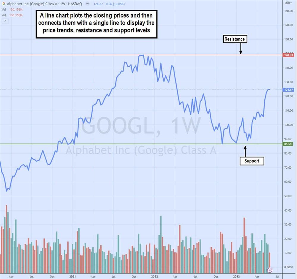
Line charts provide a general overview of the overall price trend and illustrates support and resistance levels. Line charts plot the closing prices and then connect them using a single line. Trendlines can be added to the line chart to find support and resistance levels, which are areas that consistently deflect and reverse the price trend.
Candlestick Charts
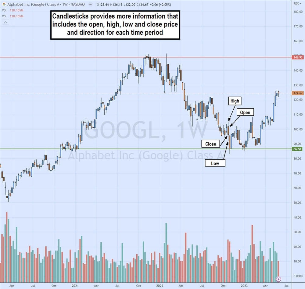
Candlestick charts are the most widely used charts by traders. Japanese rice traders used these in the 1700s. These comprise a series of "candlesticks" representing the price history for that specific period.
Each candlestick comprises four parts: the opening price, the highest price, the lowest price and the closing price.
A weekly candlestick would plot the price of the first trade for the week and the last trade for the week. This comprises the body of the candle. If the last trade is lower than the first, it would be colored red indicating prices moved down for the week.
If the last price closed higher than the first, the candle would be colored green, indicating that prices ended the week high. The high and low of the week are illustrated by a thin straight line above and below the body. These are called "wicks," "shadows" or "tails."
Bar Charts
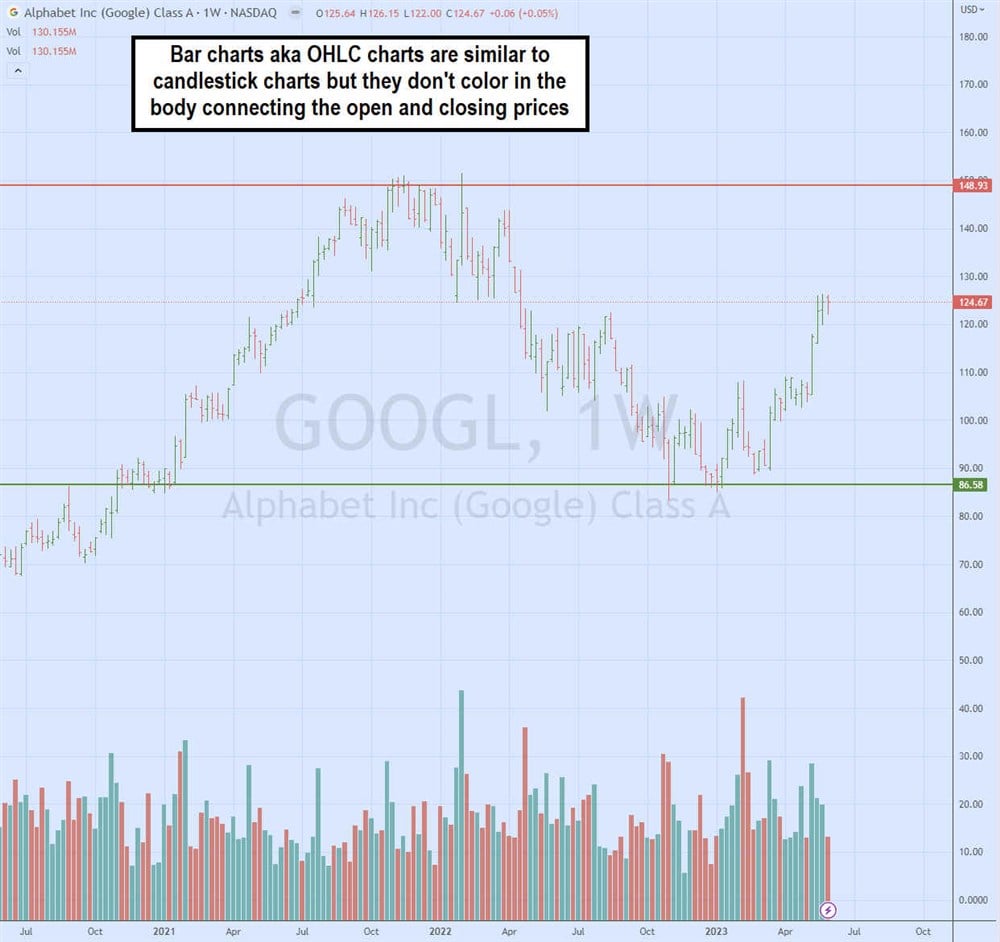
Bar charts are similar to candlestick charts as they feature the same information, including the open, high, low and close prices. In fact, it is also referred to as an OHLC chart. The bar's close indicates if the prices went up (green) or down (red) for the period. The horizontal nubs indicate the open and closed prices. Unlike a candlestick chart, they don't color in the open and close prices to indicate a "body."
Stock Chart Components
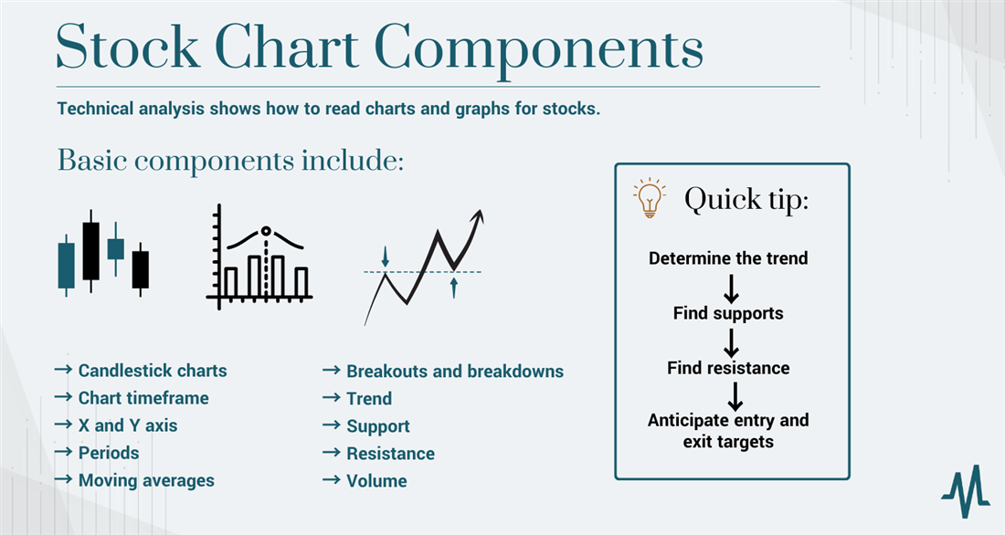
Technical analysis shows how to read charts and graphs for stocks. Every stock chart has essential components to it. You can add indicators to help read charts and find price patterns. Let's go over the features of a candlestick chart.
Candlestick Charts
Rice traders first used candlestick charts in the East. Steve Nison first introduced the concept to Western civilization. Rather than making a simple plot representing a price, a candlestick represents four pieces of information per trading period. That is the opening, the highest, the lowest and the closing price. The open and close form the body and are colored in red for a lower close or red for a higher close. The highs and lows illustrate tails or wicks. Together, they look similar to a candlestick.
For a five-minute candlestick chart, each candle represents the opening price of the first trade for that period, the highest price traded, the lowest price traded, and the closing or last price traded during the period. If a candlestick is painted red, the open price is higher than the close price, meaning more selling pressure has pushed down the price.
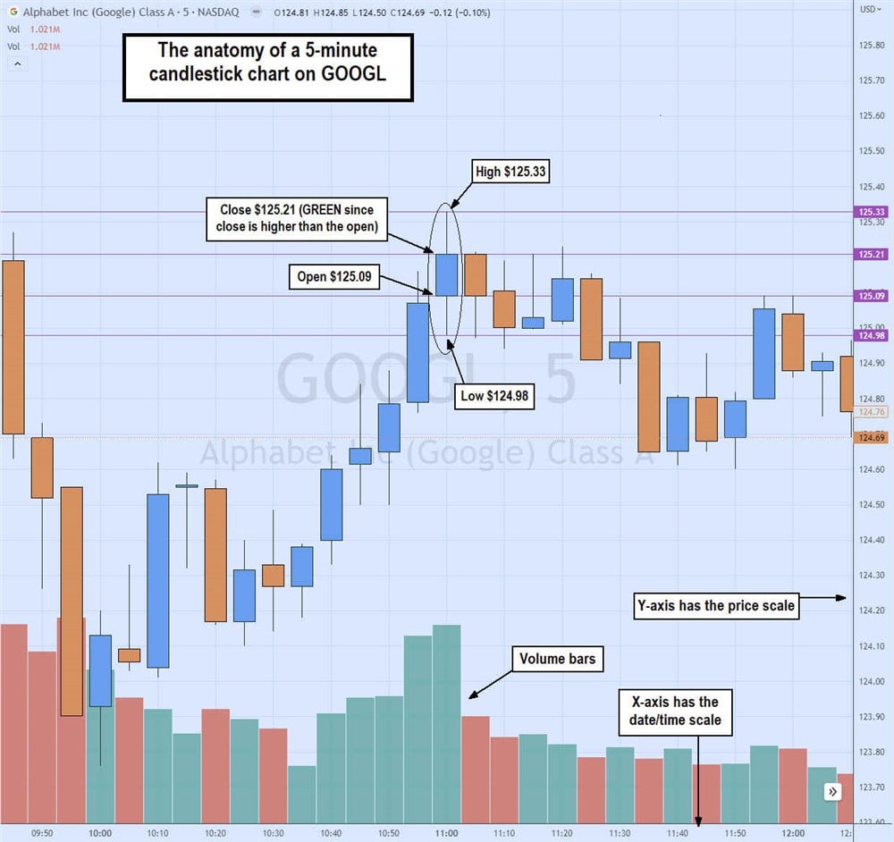
A green candlestick means the close price is higher than the open price indicating more buyers helped to lift prices. The wicks or tails represent the highest and lowest prices during that time. These four components work into every candlestick. The candlesticks are viewed throughout the day to gauge price patterns.
Chart Timeframe
Every stock chart has a timeframe with period price data to help you learn how to interpret stocks. Timeframes can range from one, five and 15 minutes to a daily, weekly and/or monthly chart. The timeframe represents the intervals for each data point. A 15-minute chart will plot the price action for each 15-minute interval, whereas a weekly chart will plot the price action every week. It doesn't mean the chart is 15 minutes long or a day long; the timeframe is the interval of each period in the chart.
X and Y Axis
Every chart has an X and Y axis. The X-axis has the date/time, and the Y-axis contains the price scale. The axes pinpoint the resulting price action for a particular date. Each date is a data point amassed together to gain a complete picture of the price action.
Periods
Periods are the number of intervals for each plot on a chart. For example, a daily chart with a 200-period moving average represents a chart plotted daily with dates on the X axis, price on the Y axis and a moving average derived every 200 days for a single plot. The average closing price of a stock for 200 days is then continuously plotted on the chart and connected to form a moving average line.
Moving Averages
As the name states, a moving average (MA) is the average price calculated by the number of specific periods plotted on the chart and connected to form a continuous line. For example, a 15-minute, five-period moving average plots the average price for every five of the 15-minute interval price data on a 15-minute timeframe chart.
People use moving averages as dynamic price support or resistance level. A simple moving average is often used with different periods to determine supports and resistances. Moving averages can vary from exponential to weighted averages that factor in volume. A commonly used moving average is the 200-period moving average.
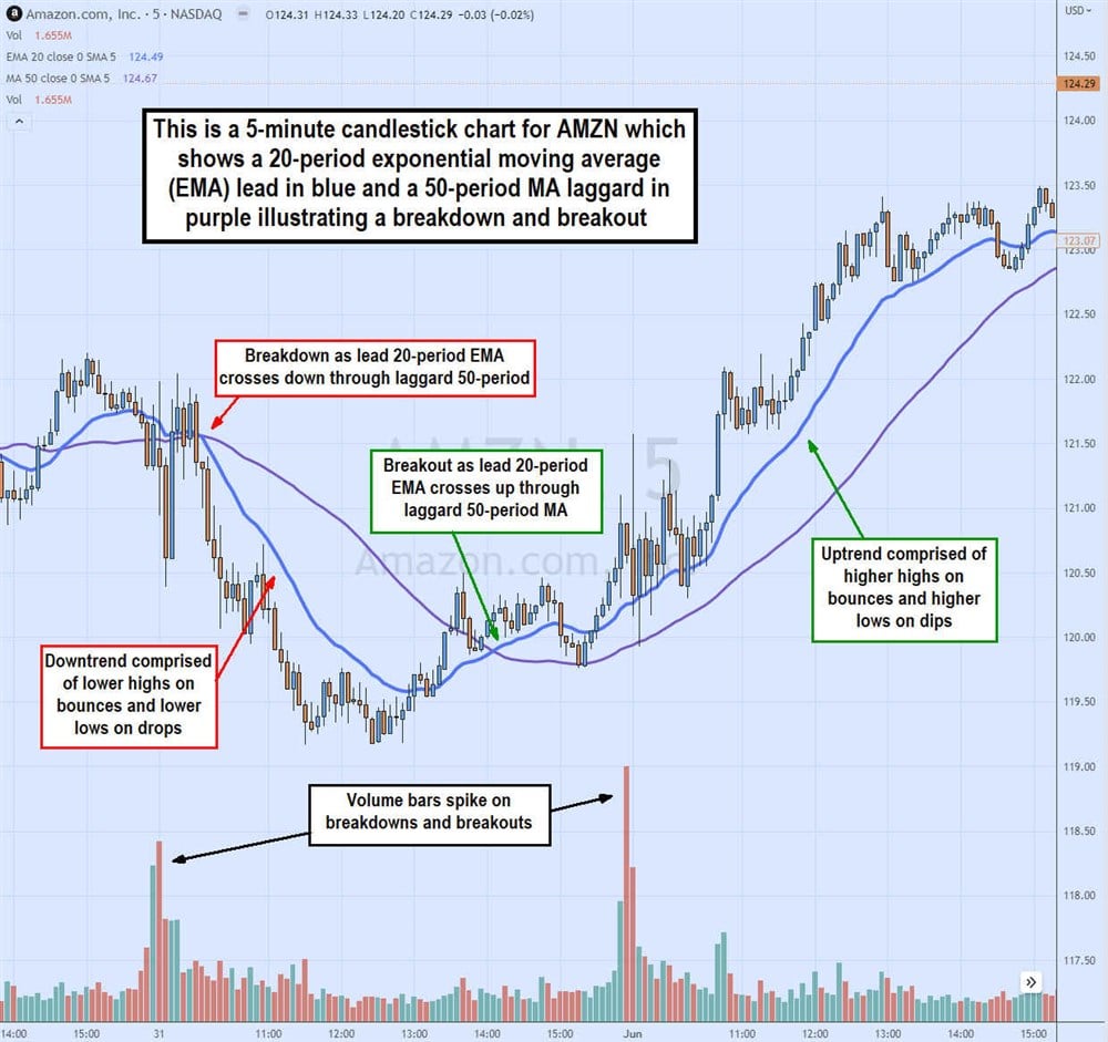
When used on a daily chart, it's referred to as the 200-day moving average, widely used as a support or resistance reference point for stocks in the news. Using two moving averages, such as a five-period and a 15-period MA can help spot price breakouts and breakdowns as the lead five-period MA crosses over/through the laggard 15-period MA.
Breakouts and Breakdowns
A breakout precedes an uptrend. Breakouts happen with price surges through a resistance level or upper part of a range to start making higher highs and lows. It's illustrated on a candlestick chart with moving averages when the lead moving average crosses over the laggard moving average. Breakdowns are the opposite: the price falls under a support level or lower trading range and starts to make lower lows and lower highs. This is illustrated by the lead moving average crossing over the laggard moving average.
Trend
A stock price is always in one of three potential modes. An uptrend means a stock makes higher highs on pops and higher lows on dips, illustrated by rising moving averages with each period showing a higher high price and a higher low price. A downtrend is the opposite. Each candlestick shows a lower low on drops and a lower high on pops. When there are no continuous higher highs or lows, it's in a consolidation mode where the stock "rests" in choppy price action until it tries to break out to an uptrend or break down to a downtrend again.
Support
Price support is a price level that continues to deflect attempts to fall below it. It indicates buyers waiting and willing to absorb selling at certain price levels. Supports are good levels to buy on pullbacks. A stock has multiple support levels. Some levels must be plotted as support when it holds multiple price breakdown attempts. These can be eyeballed on a chart and plotted with a trend line. You can use moving averages to determine price support levels. The 20-period EMA acts as a firm price support.
Resistance
Price resistance levels are price levels with enough sellers to prevent the price from rising through it. Resistance levels can often be used as price targets on uptrends to sell your stock. Resistance levels indicate prices with too many sellers that can absorb all the buying to prevent prices from rising higher.
Stocks have multiple resistance levels that can be plotted with trend lines and/or moving averages. Remember that each timeframe can have its own price support and resistance levels.
The widest periods and timeframes usually have the strongest support and resistance levels. For example, a weekly 200-period resistance tends to be much stronger than a five-minute 200-period resistance. The 20-period EMA can be a strong resistance level during a downtrend.
Volume
Stock charts can also track the volume indicated by the date, usually in a bar format. Volume determines the strength of a breakout or breakdown, as heavy volume implies more pressure in a particular direction for the stock price. Volume is often a sign of liquidity, enabling better pricing with tighter bid and ask spreads.
Be careful with low-priced stocks, which tend to have less liquidity and carry more risk. Consider sticking with the best stocks for $5 or less.
Stock Chart Patterns
Here, we will review some of the more popular stock chart patterns. These patterns are based on historical price action. When a particular type of price action forms, it has historically triggered a consistent reaction. That's the point of technical analysis, to use history to hypothesize how the stock will move.
Remember that nothing's 100%, but technical analysis makes you aware of where a stock price can go so that you can react when it arrives. There are numerous stock chart patterns. We will cover the most popular and common ones. Remember that these chart patterns are linear across all time frames. We will cover the general type of pattern and its variations, along with illustrations to help you identify them and use them to improve your trading and investing performance.
Flags
Flags are pausing patterns that form after an extended move up or down (flag pole) as the stock rests before blasting in the direction of the earlier trend on a new leg. The flag forms on the parallel channel pullbacks connecting the highs and lows. The breakout or breakdown triggers the flag pattern. They are called flags because they form a sharp break after the flagpole and pullback forming a continuation of the previous trend.
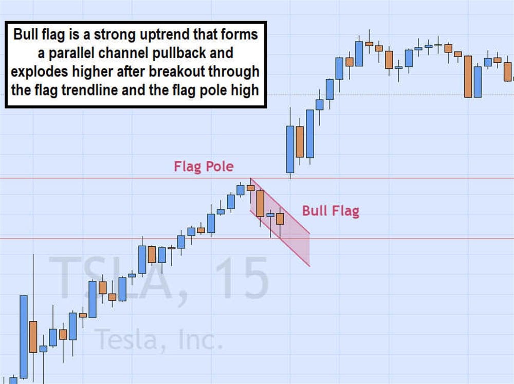
- Bull flags: Bull flags form after a strong move up, forming the flagpole, then pause on a pullback down in a parallel channel. A sharp breakout through the upper trendline surges the price through the high of the flagpole, forming the continuation of the original uptrend.
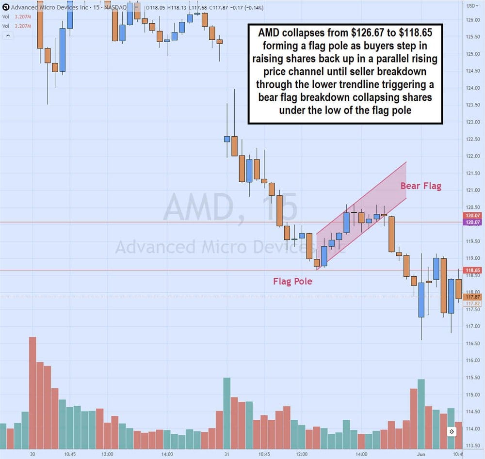
- Bear flags: Bear flags form after a strong move down, forming the flagpole. The pullback up in a parallel channel sets up for the sharp breakdown when shares collapse through the lower-rising trendline as they collapse through the low of the flagpole.
Triangles
A triangle is a pattern comprised of a flat top or bottom and a rising or falling trendline. Eventually, the flat trendline or the diagonal trendline breaks to usher in the next leg of the trend. There are three types of triangles.
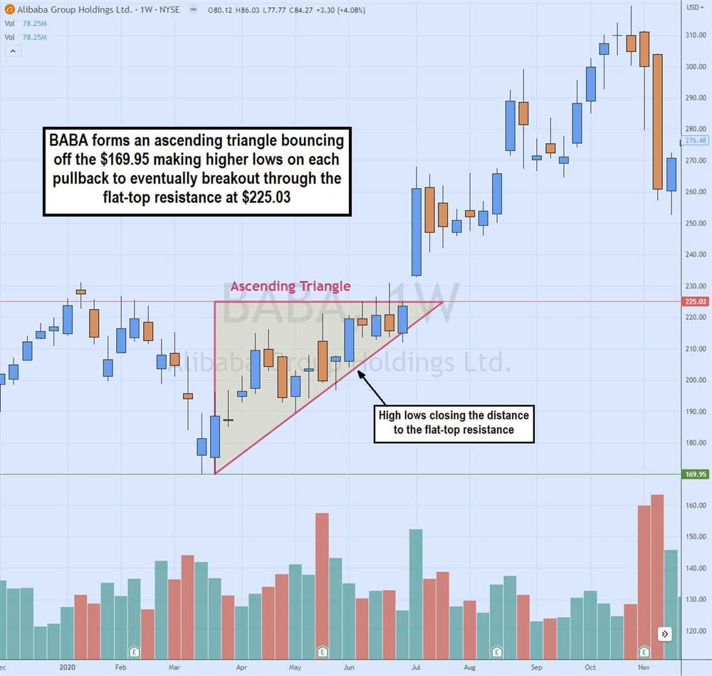
- Ascending triangles: Ascending triangles are bullish patterns where the stock continues to reject at the upper trendline forming a flat-top resistance. At the same time, buyers keep pushing up the pullback lows forming an ascending trendline and a right triangle. The breakout triggers when shares break through the upper trendline resistance forming a new uptrend.
- Descending triangles: Descending triangles are bearish patterns where the stock continues to hold a flat bottom support against a descending trendline of lower highs on each bounce attempt. Eventually, the falling trendline closes the distance to the flat bottom trendline and triggers a breakdown causing shares to collapse lower, forming a new downtrend.
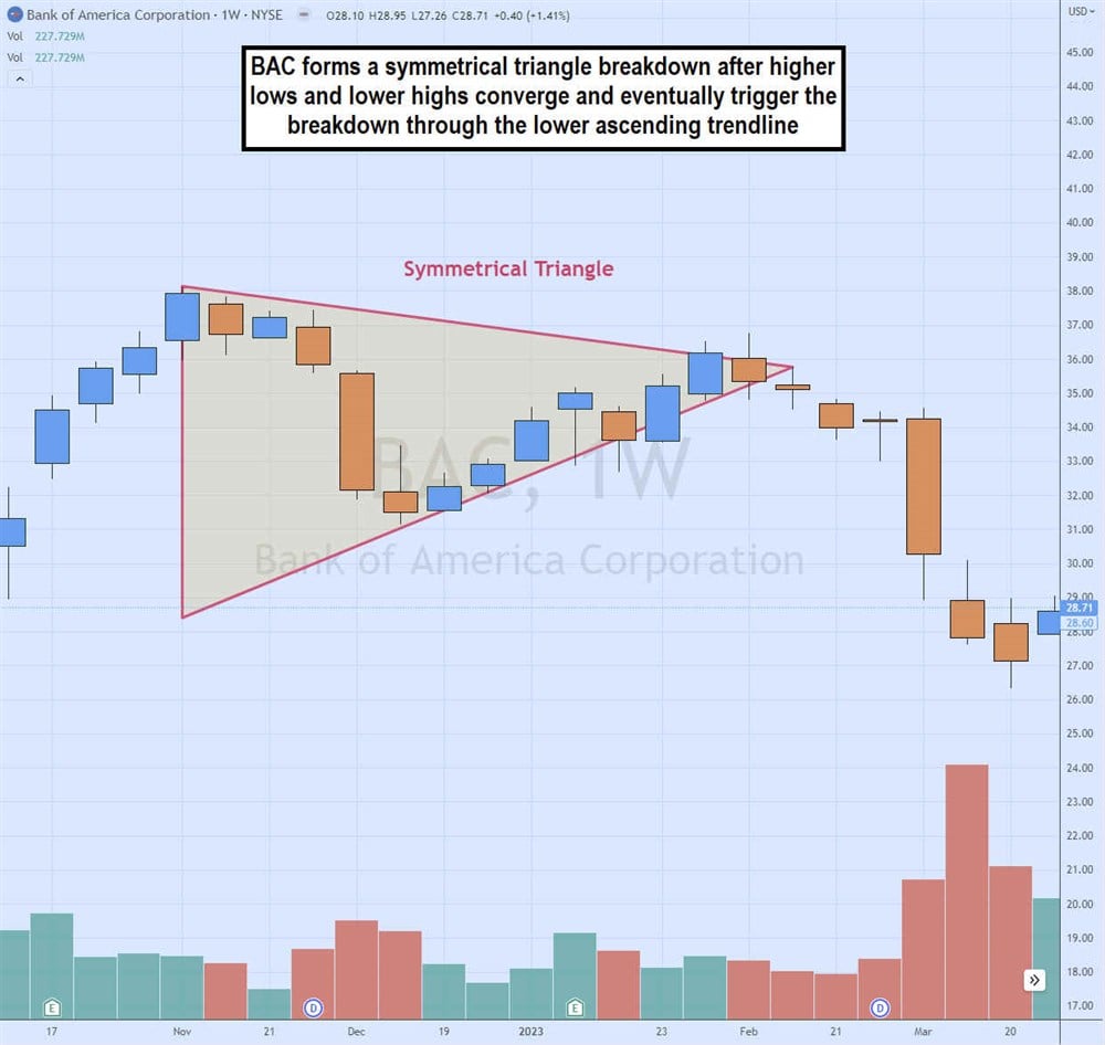
- Symmetrical triangles: Symmetrical triangles can be bullish or bearish patterns depending on the breakout's direction. They comprise a descending upper trendline of lower highs and an ascending trendline of higher lows as the trading channel compresses as it gets closer to the apex before triggering a breakout through the upper falling trendline or breakdown through the lower rising trendline.
Head and Shoulders
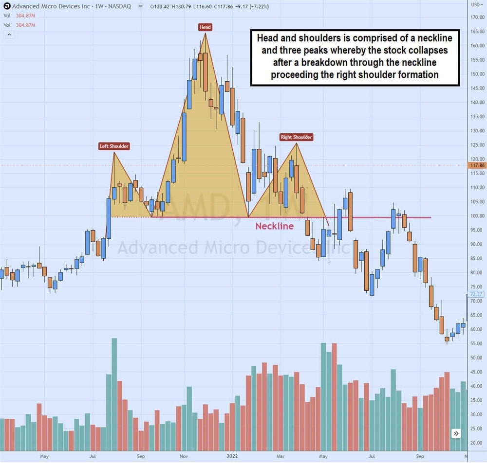
Head and shoulders is a bearish pattern comprised of a baseline called the neckline with three peaks comprised of a left shoulder, head and right shoulder. The left shoulder forms the first new high before a pullback to the neckline that causes buyers to drive shares to a new higher high, forming the head. Shares pull back to the neckline again before bouncing to form the right shoulder, which doesn't make a new high and often peaks at or near the high of the left shoulder. Shares fall from the right shoulder through the neckline to trigger the head and shoulders breakdown. The neckline may be flat or diagonal. When traders short the neckline breakdown, they use a trailing stop if the right shoulder breaks out again to give it enough room and not get wiggled out of a much more significant sell-off.
Cup and Handle
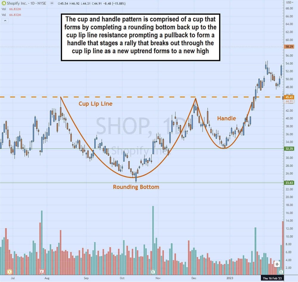
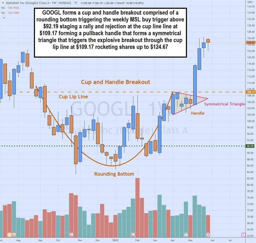
The bullish cup and handle pattern comprises a rounding bottom cup followed by a handle pullback that breaks out through the cup lip line forming a sharp rising uptrend as new buyers rush into the stock. The cup forms after a swing high that falls to make multiple lows, eventually forming a rounding bottom as it stages a rally back to the cup line. The cup lip line is the resistance level that gets tested on completing the cup formation. After a pullback, shares regain momentum to re-test the cup lip line for a breakout to new highs as an uptrend ensues.
Double Tops and Bottoms
As the name implies, a double top is a price level resistance that triggers a price rejection and reversal around the same level. It forms an initial peak and reversal followed by another re-test and rejection followed by a sell-off.
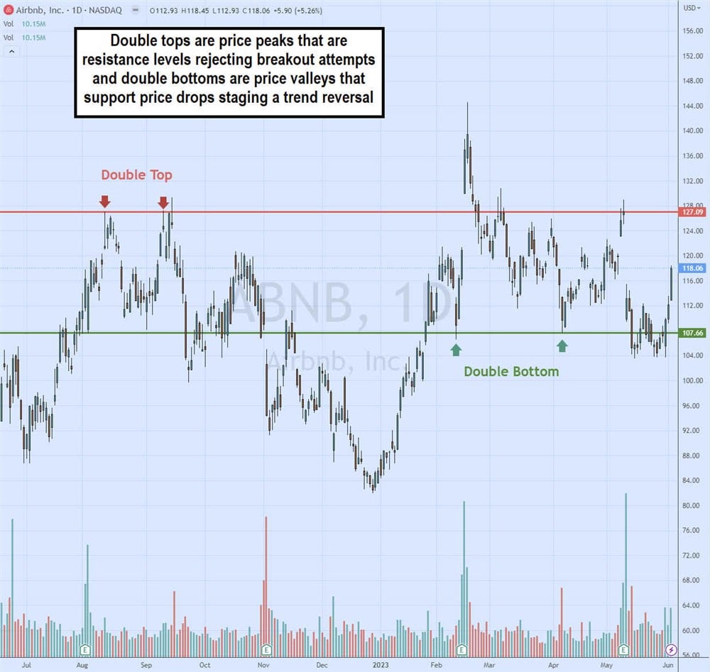
A double bottom is the inverse of a double top. A stock falls to hit a support level that deflects the stock back up. Shares eventually peak and fall again to re-test the support price level on the second attempt that reverses shares to stage a rally back up.
Bottom double tops and double bottoms make strong resistance and support levels. Once broken, they can become strong support and strong resistance levels. These levels can be plotted with a horizontal trendline. While they may break, the price levels continue to linger, being an area that triggers a reaction.
Rectangles
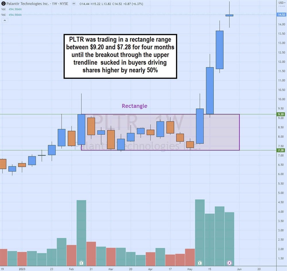
Rectangles are trading ranges that are comprised of multiple tops and multiple bottoms. By connecting the tops and bottoms, a rectangle pattern can be identified. A breakout occurs when the stock penetrates the upper trendline resistance and uptrends higher. A breakdown occurs when the stock falls under the lower trendline support forming a downtrend.
Market Structure
These are reversal patterns using candlesticks. They are very effective alone and especially in combination with other chart patterns. There are two types of market structure patterns. These are three candle formations comprised of a high, higher, and higher low for a market structure high (MSH) sell trigger or a low, lower low, higher low for a market structure low (MSL) buy trigger. There should be four or more preceding candlesticks before the market structure formation.
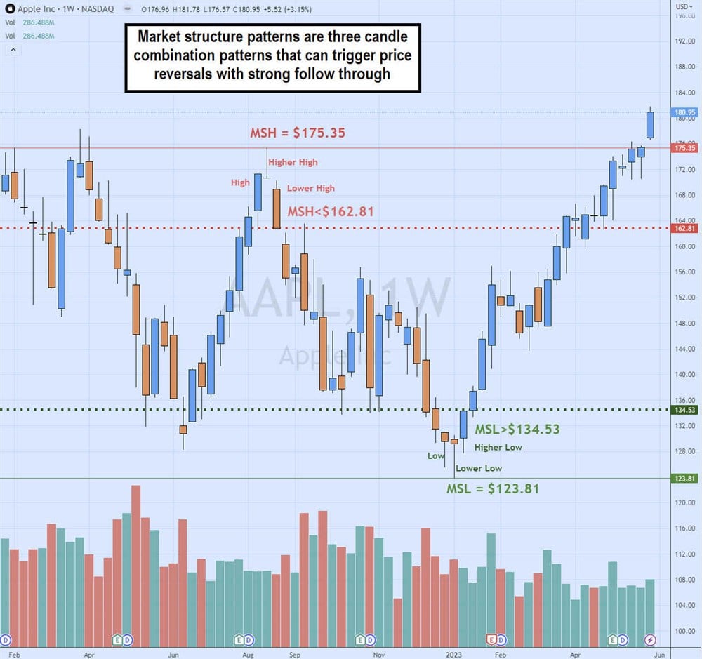
- Market Structure Low (MSL): MSL is a reversal pattern that forms a buy trigger after a pullback. At least four lower-low candles precede it. The final three candles should comprise a low candle, then a lower low candle and a higher low candle. The buy triggers on the high of the higher low candle (last candle), called the market structure low trigger (MSL trigger). For example, on the AAPL chart, the lower low candle low is $123.81. The next candle has a higher low, which makes it a trigger candle. The high of the trigger candle is $134.53. A buy triggers when the stock rises through $134.53. In the example, the weekly MSL trigger buys above $134.53 are set up and extended toward $181.
- Market Structure High (MSH): MSH is a reversal pattern that forms a sell trigger after a price run-up comprised of at least four preceding higher high candles. The pattern forms after a high, then a higher high candle followed by a lower high candle, which is also the trigger candle. The low of the trigger candle is the MSH trigger. In the chart example with AAPL, the MSH triggers after its run-up to a high of $175.35. The next candle forms a lower high at $170.27, which makes it a trigger candle. The low of the trigger candle or MSH trigger is $162.81. Therefore, a trader could short-sell AAPL on the breakdown of $162.81, resulting in a sell-off of $134.50s and $123.81.
Advanced Stock Chart Terms
Here are some more advanced terms you may find regarding stock terms and analysis and learning how to read stock market reports.
- Bid and ask: The bid is the price buyers are willing to pay for a stock. Usually, people tend to sell their stock at the bid price. The ask is the price sellers will sell you the stock. Usually, people tend to buy at the asking price. Prices fluctuate throughout the market trading day as the bid and ask prices rise when there is buying pressure and fall when there is more selling pressure.
- Beta: Beta is a volatility ratio compared to the S&P 500 benchmark index. A beta of 1.0 indicates that the stock usually trades in line with the S&P 500. A beta above 1.0 indicates that the stock tends to be more volatile than the overall market. For example, a stock with a beta of 2.0 typically moves twice as much as the S&P 500 based on its price history. If the S&P 500 is up 1%, a stock with a beta of 2.0 should be up 2%. Here's a list of FAANG stocks with high betas for more risk-average investors. The most active stocks, dollar-for-dollar, tend to have some of the highest betas—a beta under 1.0 moves slower than the S&P 500. For example, a stock with a 0.5 beta tends to move half as much as the overall market on any particular trading day. Low beta stocks have less volatility and less risk versus high beta stocks. Older investors commonly invest in blue-chip stocks with low beta and dividend payouts.
- EPS: EPS is the earnings per share ratio derived from dividing the company's earnings by the number of outstanding shares. For example, a company that made $1,000,000 in profits with 5,000,000 shares outstanding had an EPS of $0.20 per share. Analysts have a consensus of what they expect a company to earn using EPS per share. Companies that report better than estimated earnings per share tend to get rewarded with higher stock prices, unless they lower their guidance for the next quarter to a lower EPS.
- Ex-dividend date: The ex-dividend date is when a dividend distributes to its common shareholders on record. Preferred stock owners should know how preferred stock is different from common stock.
- One-year target estimate: The one-year target estimate is a price prediction of where a stock price can go one year later. These are predictions (mostly best guesses), even from highly regarded analysts. Take them with a grain of salt. No one can predict the future, much less quantify it by price.
How to Analyze a Stock Chart
Once you understand a stock chart's concepts and components, it's time to put them to use. After learning how to read charts and graphs for stocks, it’s time to analyze them. Analyzing a stock chart means interpreting the price action. Learning how to read stock market charts is about learning how to interpret stocks. Regarding price action, there are three things to gauge: trend, support and resistance. These three pieces of information are the basis for price patterns and all price interpretations.
Step 1: Determine the trend.
First, observe the direction of the trend. Is the stock price rising on the chart with higher highs and higher lows? If so, it's an uptrend. If the five-period MA and 15-period MA are both increasing, then that helps to confirm and illustrate the uptrend.
The combination of moving averages should be a lower period and a higher period. Vice versa, if the five-period MA and 15-period MA are both falling as the stock makes lower lows and lower highs on bounces, then it's in a downtrend. Some of the more commonly used period combinations are the 5/15, 20/50 and 50/200-period MAs. Exponential moving averages (EMAs) can also be used in understanding stock graphs.
Step 2: Find supports.
With moving average charts, the lead moving average is the smaller moving average, and it acts as support if the price is rising. The lagging moving average is secondary support for a rising stock. For example, a 20/50 period MA chart would have the 20-period MA as the support and the 50-period MA as the secondary support on an uptrend.
You can also plot supports using historical price levels that have successfully absorbed selling and caused the price to bounce back up. If a price level holds on two separate occasions with wide intervals, then it can be a double support level. Support levels that break down can become new resistance levels as a downtrend forms to lower the stock price.
Step 3: Find resistance.
If the price falls, causing the 20-period MA to cross over through the 50-period MA, it has turned into a downtrend. The 20-period MA is a resistance, and the 50-period MA is a secondary resistance as the stock makes lower lows and lower highs on bounce attempts.
If a stock historically rejects certain price levels, you can plot a horizontal trend line as a resistance level. This would be a level to sell any positions and not chase entries. A new uptrend to a higher resistance level is possible if a resistance level breaks out. Resistance levels that break out can turn into new support levels as price uptrends to new resistance levels.
Step 4: Identify chart patterns.
Try to identify any of the earlier-mentioned chart patterns. Sometimes you will see multiple chart patterns in the same direction converging. The stock patterns can help you anticipate where the stock can move based on its history. The goal is to interpret the price action to gain insights into the potential forward movement of the stock.
Step 5: Anticipate entry and exit targets.
Knowing where there are support and resistance levels along with the direction of the trend, you can use this information to take action. You can pinpoint certain price levels you may want to enter or add to a stock position near supports. You can identify certain price levels to exit part or all of your position in a stock based on the resistance levels ahead. These three pieces of information, including trend, support, and resistance, can help interpret stocks and help understand stock graphs.
How to Compare Stock Charts
Once you can identify chart patterns and learn how to read a stock chart, you can compare stock charts. Make sure you are comparing apples to apples and oranges to oranges. This means ensuring some kind of correlation between the stocks like sector, industry, theme, strategy or trend.
When you can find stocks with positive and negative correlations, opportunities can arise where you can trade the lagging stock with a leading stock. You can also hedge a long position with a negatively correlated stock since they should move in opposite directions.
Positively correlated stocks tend also to carry the same chart patterns. For example, if XYZ has a daily ascending triangle pattern, then peer stock ZYX should also have a daily ascending triangle pattern. If it doesn't, then ZYX may be a laggard buying opportunity. Airline stocks tend to be positively correlated with each other since they are in the same sector and industry.
The intended purpose of investing or trading is to make profits. Since stocks are valued by their prices, learning how to read stock charts only makes sense. Along with fundamental research learning about business operations and performance, understanding the price action is all part of a balanced research process. The purpose of fundamental and technical analysis is to derive the knowledge needed to make more informed decisions regarding your stock market investments.
The chart patterns we reviewed are more common than you may think. Applying technical analysis will help you better interpret the price history and, in turn, enable you to anticipate where the price may be headed. The job is not to predict but to react; stock charts prepare you to react to price moves. Continue to learn more chart patterns after you get familiarized with the basics.
FAQs
Here are some answers to more frequently asked questions about reading stock charts.
How do you analyze a stock chart?
Select the type of chart and timeframe, like a candlestick chart on a weekly timeframe. Use indicators like moving averages to visualize the trend and spot support and resistance levels. Plot horizontal support and resistance trend lines are price levels where the price has deflected several times.
What does a stock chart tell you?
A stock chart interprets the price action, which gives you a visualization of the trend or direction of the stock price and the various inflection points where the price is held as support or rejected as resistance. The trend provides the stock's sentiment, while support and resistance provide entry or exit target levels if you decide to move.
How do you read stock trends?
You can eyeball the candlestick charts for uptrends, which are rising higher highs and high lower candles, or downtrends, which are falling prices indicated with lower lows and lower highs. The easier way is to use two moving averages to visualize the trend and provide quantitative support and resistance price levels.
Before you consider Alphabet, you'll want to hear this.
MarketBeat keeps track of Wall Street's top-rated and best performing research analysts and the stocks they recommend to their clients on a daily basis. MarketBeat has identified the five stocks that top analysts are quietly whispering to their clients to buy now before the broader market catches on... and Alphabet wasn't on the list.
While Alphabet currently has a "Moderate Buy" rating among analysts, top-rated analysts believe these five stocks are better buys.